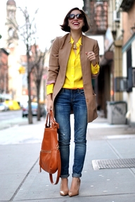
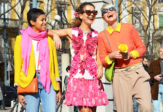
The best way for spring awakening from hibernation is by adding a splash of bubblegum-pink, radiant yellow, cobalt-blue, tangerine hues into ensemble. Of course, it takes innovative approach blending these colors, as well self-confidence to pull it off. Light-taupe and apricot-hued colors are options for less adventurous types. These colors are perfect for color-blocking pieces and would not fail to impress.
 |
| Forecasting from Fashion Snoops |
|
|
|
|
I find more similarities of scope colors with these species, rather than "urban sport" though.
Fashionistas already have adopted this luxe way to brighten their looks. Jump into a wagon of experimentation...
 |
| Tommy Ton Street-style shoots |
|
|
|
 |
| Pinned from Pinterest |
|
|
|
|
 |
| Tommy Ton Street-style shoots |
 Fashionistas already have adopted this luxe way to brighten their looks. Jump into a wagon of experimentation...


I like the palette for spring--the of grey/tan/black shades are what we New Yorkers gravitate toward in winter, and the pops of color help bring spring along. Then the warmer it gets, the less you rely on the dark colors and gravitate toward the colorful. The orange and pink hues together are marvelously juicy!
ReplyDeleteI can see how these colors are related to sports. Bold and bright colors are often used as team colors. Celtics green, Duke Univeristy Blue, etc. But I also do think they can be interpreted as those tropical colors, as seen on the parrot.
ReplyDeleteYou are definitely right by pointing out these colors are perfect for color blocking. It just wouldn't look right if you were trying out that trend using blacks, whites and nudes. I love the bright yellow and pinks- I often find myself wearing it much sooner than some should, but I just can't help myself-- I'm all about the Spring and Summer seasons.
ReplyDeleteThe bright pinks and oranges definitely cheer me up! I wish your color palette photo was bigger though!
ReplyDelete